- Apr 30
How to choose fonts for your Podia website (without losing a weekend to it)
- Brittany Hardy
- Productivity, Tips and Tricks, Podia Help
Looking for Podia website design or marketing support?
CLICK HERE to see my next available free ☕️ chat
A Podia Pro's guide to picking type that actually fits your brand... plus a free tool I built to make it 10x faster.
Here's a conversation I've had more times than I can count:
Client sends me a beautiful, swoopy, hand-lettered display font they found on Creative Market. They love it. It's perfect for their brand.
And then I have to be the designer who says:
"Sooooo… we can't actually use that one on Podia."
Cue the slightly deflated email back.
👉 If you're building your own Podia site, you've probably had a version of this moment too (except you were both the designer and the disappointed client. Fun!).
So I built a thing to fix it. More on that in a minute. First, let's talk about why fonts matter so much in the first place.
Why fonts are doing more work than you think
Fonts and colours are the two things that quietly carry your entire brand on a website.
You can have the cleanest layout in the world. Beautiful photography. Killer copy. But if your headline is set in the wrong typeface? The whole thing reads as off. People can't always say why it feels off. They just feel it. And then they bounce.
The reverse is also true. A simple, well-paired set of fonts can make a basic page feel intentional, premium, and trustworthy.
Type is the single biggest design lever you have on Podia, right next to your colour palette. (And, it's often easier to fix than colour.)
The frustrating part: most people pick fonts the same way they pick paint colours at the hardware store. They look at a tiny swatch in fluorescent lighting, decide it's "the one," get it home, and then realise it looks completely different on an actual wall in actual daylight.
A font name in a dropdown is a paint chip. The real question is: what does it look like when it's actually carrying your headline, in your hero section, against your background, with your subhead underneath it?
That's a hard question to answer when you're scrolling through a list of 150 fonts.
The Podia font situation (and why I think it's a good thing)
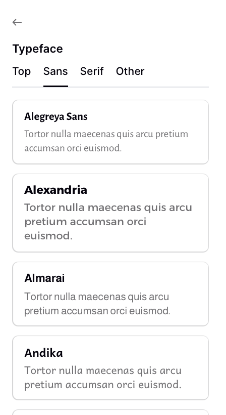
Podia gives you about 150 fonts to choose from, organised into Top, Sans, Serif, and Other.
If you're coming from somewhere like Squarespace or WordPress, where you can plug in any custom font you want, that number can feel limiting at first. Only 150? What if my brand font isn't on there?
Here's my honest take after building dozens of Podia sites:
The constraint is doing you a favour.
A few reasons:
The list is genuinely good. It's curated from Google Fonts, which means every option is designed for screens, free, and well-supported. There are no clunkers in there.
It keeps your site fast. Custom fonts are one of the sneakiest causes of slow page loads. Podia handles font delivery so your site stays snappy without you having to think about it.
It stops you from making weird choices. I love a quirky font as much as the next designer. But I've seen too many sites tank their own credibility with a display font that's too "fun" for what the business is actually selling. The Podia list keeps you in safe, professional territory while still giving you tons of personality to work with.
You can change your mind anytime. Unlike some platforms where switching fonts breaks your whole layout, Podia lets you swap fonts globally in about 10 seconds. So even if you pick "wrong," it's not a big deal.
The trade-off is real, but it's the right trade-off for the people Podia is built for: solopreneurs, course creators, coaches, and service providers who need a site that works more than they need a site that's bespoke.
OK, so how do I actually pick?
Here's what nobody tells you about choosing fonts: the font list isn't the problem.
Reading font names in a dropdown tells you almost nothing useful. "Inter" and "Manrope" sound interchangeable. They're not.
But you'd never know until you saw them next to each other, on your actual headline, against your actual background.
The way I do it for clients:
Start with the vibe. Not the font. The vibe. Are we going for modern and clean? Classic and editorial? Friendly and approachable? Bold and confident? Quiet and considered? Distinctive and characterful? Pick one before you look at any fonts.
Pair, don't pick. Almost no good site uses one font. You usually want one font for headings (the personality one) and one for body text (the readable one). Sometimes they're the same font in different weights. Sometimes they're a serif paired with a sans-serif. The pairing matters more than either individual font.
Test it with your actual words. Lorem ipsum is lying to you. Type out your real headline and your real subhead. See it. Read it out loud. Does it feel like you?
Look at it on your background. A font that looks great on white can look completely different on cream, sage, or your brand colour. Always preview against the background you'll actually use.
Live with it for five minutes. Not five seconds. Open the page, walk away, come back. If it still feels right, you've got it. If something nags at you, trust that.
If you do this whole process manually inside Podia, swapping fonts and refreshing and squinting and starting over, it takes a long, long afternoon. I know because I used to do it that way.
So I built a shortcut.
The Podia Font Pairing Tool
I made a free tool that does steps 1 through 5 in about two minutes.
Here's how it works:
You type your real headline and subhead in. No more lorem ipsum. You see your actual hero copy rendered in real fonts as you click around.
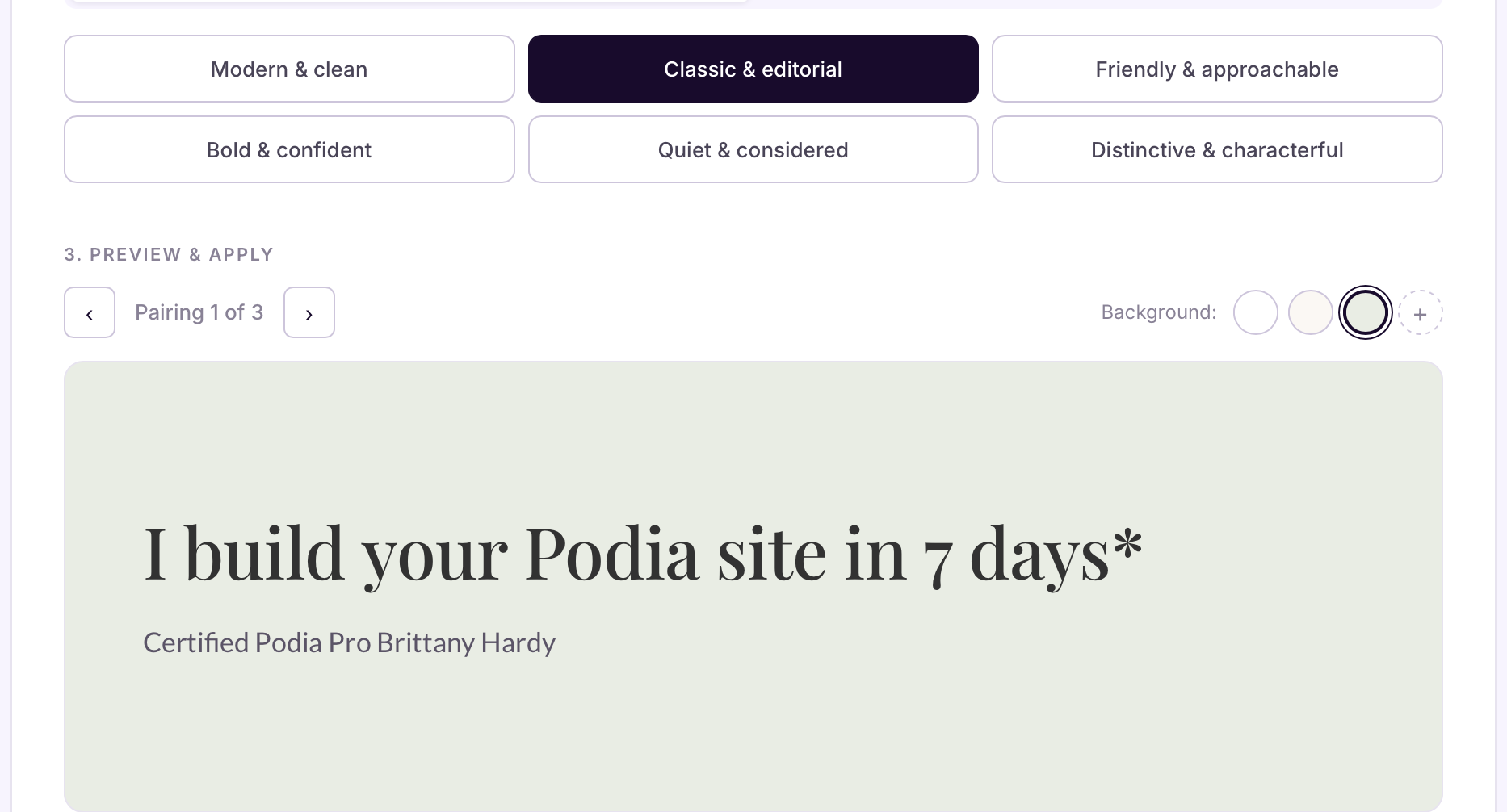
You pick a vibe. Six options (modern, classic, friendly, bold, quiet, or distinctive).
Each one has a few hand-picked pairings I've curated specifically from Podia's font library. You're not picking from 150 fonts in a dropdown anymore. You're picking from a handful of pairings I've already vetted.
You scroll through the pairings. Click an arrow to see the next one in that vibe. The preview updates instantly. No tab switching, or refreshing - hooray!
You preview against your actual background. White, cream, and sage are built in. But you can also paste in up to two of your own brand colours and see your fonts rendered on those. The text colour auto-adjusts so you can immediately see whether your fonts work on your dark brand background, your soft brand background, whatever you're actually using.
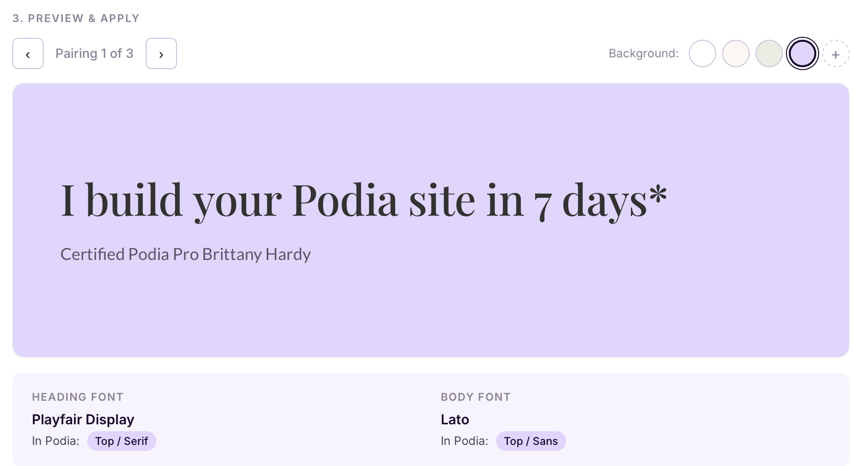
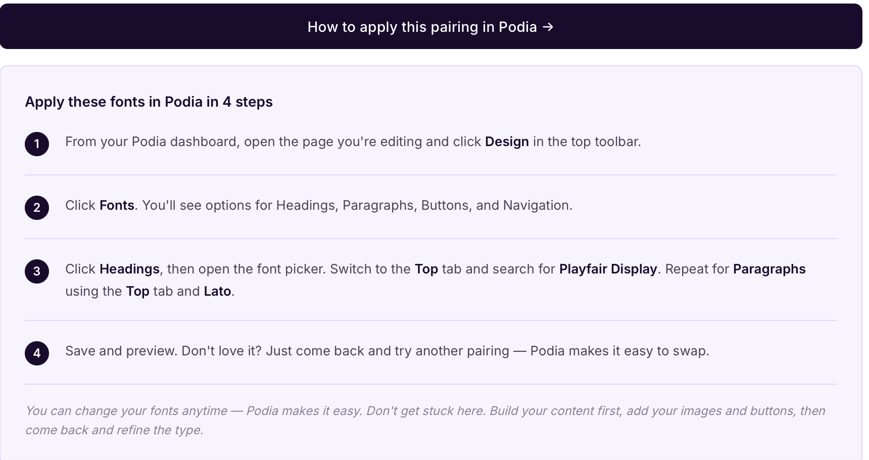
Once you find the one, the tool tells you exactly where to find it in Podia. Each font is tagged with which tab to look in (Top, Sans, Serif, or Other) so you don't have to hunt. There's also a step-by-step guide showing you how to apply the pairing to your site in four clicks.
The whole thing is one page. I made it so that you just have a fast way to make a real decision.
If you want to try it, it's free. I just ask for your email so I can send you the link. (Note: you will end up on my email list if you try the tool). I respect all CASL (Canadian Anti-Spam Legislation) and include an unsubscribe link in every email I send. I usually send 1-2 weekly newsletters with marketing tips, tricks, and stories to help your business. If you reallllllllly don't want to opt in to get the tool, reach out to me directly and I'll send it to you ;)
A few things I learned building this that might help you
Most people overthink the font and underthink the weight. The same font at 400 weight versus 600 weight reads as two completely different vibes. Before you swap fonts entirely, try just changing the weight on what you've got. Sometimes that's the whole fix.
One font is often enough. You don't actually need a heading font and a body font. Picking one good font and using it at different weights is a perfectly valid (and very modern) approach. Inter, Manrope, and Karla all do this beautifully on Podia.
Serifs are not old-fashioned. A lot of people default to sans-serif because it feels "modern." But serifs (Playfair Display, Lora, EB Garamond, Cormorant) bring warmth and editorial credibility that sans-serifs can't. If your brand is about depth, expertise, or craft... try a serif headline. You might be surprised.
System fonts are fine. Podia has a "System (default)" option that uses whatever font your visitor's device prefers. It loads instantly and looks clean on every device. If you're paralysed by choice, this is a perfectly good answer.
A reminder, since this is me writing
Don't get stuck on this.
I've watched smart, talented business owners spend literal weeks agonising over fonts when they could have spent that time writing their sales page or shipping their offer.
👉 Pick something good. Move on. You can change it later in 30 seconds.
Your fonts are not the reason your business will or won't grow. But picking them well is one of those small things that quietly makes everything else feel more cohesive... your emails, your social graphics, your sales pages, your checkout. Worth doing properly. Not worth losing a weekend over.
That's exactly why I built the tool. So you can do it properly and fast.
💛 -Brittany
FAQ
How many fonts can I use on a Podia website?
Podia gives you separate font controls for Headings, Paragraphs, Buttons, and Navigation... so you can technically use up to four different fonts. In practice, I'd recommend sticking to one or two. More than that and your site starts to feel disjointed.
What's the best font for a Podia website?
There isn't one "best" font. It depends on your brand vibe. That said, the most universally flattering options on Podia are Inter, Manrope, and Karla for body text, and Playfair Display, Lora, or Montserrat for headings. The Font Pairing Tool I built has six different vibe categories with curated pairings if you want a faster shortcut.
Can I upload a custom font to Podia?
No, Podia doesn't allow custom font uploads. You're limited to their library of around 150 Google Fonts. I know that sounds limiting, but the curated list is genuinely solid, and it keeps your site fast and accessible. If your "must-have" custom font isn't available, there's almost always a close match in Podia's library.
Do fonts affect my Podia website's loading speed?
Yes, but Podia handles font delivery in a way that's already optimised, so you don't have to worry about it. The fonts are served from Google Fonts' fast CDN, and Podia only loads the fonts you've selected. Your site stays snappy without any extra setup on your end.
How do I change fonts on my Podia website?
From your Podia dashboard, click into the page you're editing and hit Design in the top toolbar. Then click Fonts. You'll see four sections: Headings, Paragraphs, Buttons, and Navigation. Click any of them to open the font picker, switch between tabs (Top, Sans, Serif, Other), and pick your font. Changes save automatically.
What's the difference between serif and sans-serif fonts?
Serif fonts have small decorative strokes (called "serifs") at the ends of letters (think Times New Roman or Playfair Display). They tend to feel more traditional, editorial, or warm.
Sans-serif fonts ("without serifs") are cleaner and more modern-looking (think Helvetica or Inter). Neither is better; they just signal different things. For headlines, serifs often add personality. For body text, sans-serifs are usually easier to read on screens.
How many fonts should I use on a website?
Two is the sweet spot. One for headings, one for body text. You can get away with one (using different weights for hierarchy) or three (if you've got a really specific reason). More than three and you're almost certainly making your site harder to read.
Can I change my Podia fonts after my site is live?
Yes! This is one of my favourite things about Podia. Changing fonts takes about 10 seconds and updates everywhere on your site instantly. So don't agonise over the "perfect" choice... pick something good, launch, and refine later.
Are Google Fonts free to use on my Podia site?
Yes. Every font in Podia's library comes from Google Fonts, which means they're all free for personal and commercial use. You don't need to buy any licenses or worry about usage rights.
Brittany Hardy is a Certified Podia Pro Website Designer and the founder of Empty Desk Solutions. She helps solopreneurs and small business owners build websites that actually work, on platforms that don't get in their way.