- Sep 5, 2025
Should You Make a Mobile Site or a Desktop Site? How to Decide in 2025
- Brittany Hardy
- Tips and Tricks
Looking for Podia website design or marketing support?
CLICK HERE to see my next available free ☕️ chat
Should You Make a Mobile Site or a Desktop Site?
If you are building or updating a website, you might be asking: should I make a mobile site or a desktop site? Closely tied to that is another common question: should I optimize for mobile or desktop? These are smart questions, because how your site looks and functions on different devices can make or break your success online.
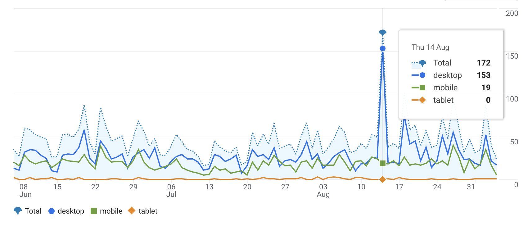
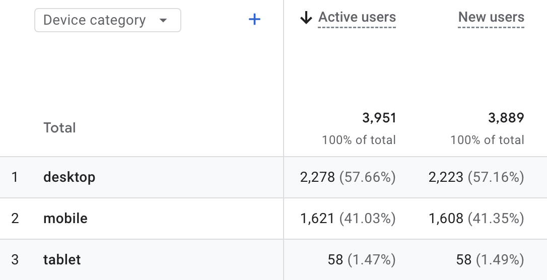
The short answer is that you do not have to pick one over the other. The best websites today are built to work on both. But there are important details about when to prioritize mobile or desktop that can help you make the right choice for your business. I was SHOCKED when I looked at my own analytics about what the breakdown was!
Why This Question Matters
People search and browse differently depending on whether they are on their phone or computer. Globally, mobile now accounts for more than half of internet traffic. At the same time, desktop remains dominant for certain industries and tasks, especially when users need more screen space or are completing longer, more detailed processes.
If you focus only on one, you risk losing customers and hurting your search rankings. Both user experience and SEO are at stake.
A Quick Look at Website Design Evolution
A few years ago, many businesses had separate desktop and mobile sites, often with a mobile URL like m.yourwebsite.com. That approach is outdated today.
Now, the gold standard is responsive design. This means one website that automatically adapts to any screen size. Whether someone visits on a phone, tablet, or desktop, they see the same site styled to fit their device.
Google also uses mobile-first indexing. This means the search engine looks primarily at your mobile site when deciding how to rank you. If your site is not mobile-friendly, you risk slipping in search results.
Mobile vs. Desktop: What to Consider
There are clear differences between how people use mobile and desktop:
Mobile: smaller screens, touch navigation, often used for quick searches, local lookups, and fast actions.
Desktop: larger screens, keyboard and mouse navigation, preferred for research, detailed browsing, and professional use.
For example:
Many people browse products on mobile but complete purchases on desktop.
B2B and professional services still see more traffic from desktop users.
Should You Make a Mobile Site or a Desktop Site?
You should not choose between a mobile site and a desktop site. The best approach is to create one responsive site that works well on all devices.
Having two separate sites is harder to maintain, confuses your audience, and can hurt your SEO. With responsive design, you only need to update content once, and it automatically works everywhere.
Should You Optimize for Mobile or Desktop?
This is where things get more nuanced. The best answer is that you need to optimize for both, but your priority should depend on your audience.
Most businesses should start with mobile-first design. Since Google uses mobile-first indexing and most global traffic comes from phones, this ensures your site performs well in search and gives a smooth experience for most visitors.
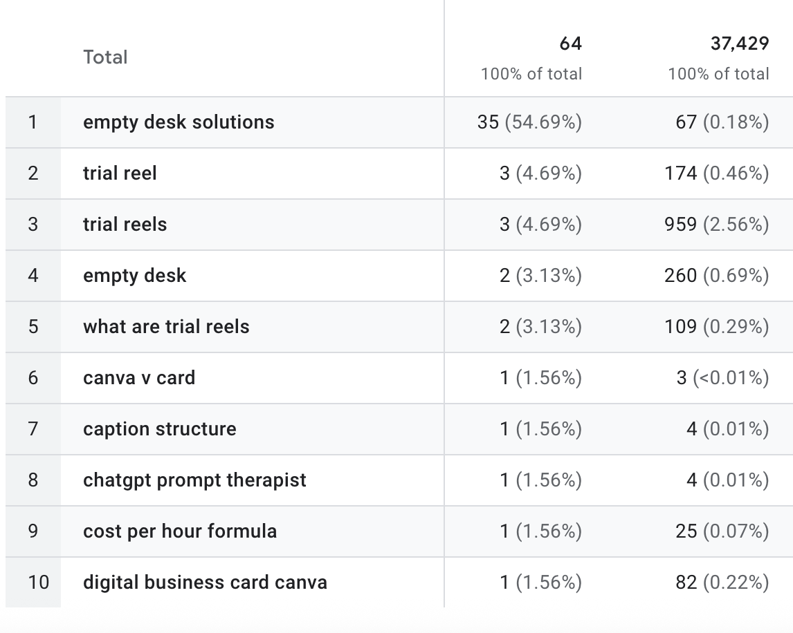
Use your analytics. Look at your data to see where your audience comes from. If 80% of your traffic is mobile, that is where to focus. If you are in an industry where desktop dominates, do not ignore that.
Example:
A local restaurant should prioritize mobile because customers are likely searching on their phones.
A B2B software company should still prioritize desktop since buyers may be researching on large screens during work hours.
Practical Optimization Tips
Here are a few things you can do to make sure your site is ready for both mobile and desktop:
For mobile:
Keep page load speed fast.
Use thumb-friendly buttons and links.
Make sure menus are easy to navigate.
Keep text large enough to read without zooming.
Simplify the checkout process.
For desktop:
Use strong visuals that take advantage of larger screens.
Provide detailed content for users doing deeper research.
Ensure forms and longer processes are easy to complete.
For both:
Use a responsive website builder or theme (WordPress, Webflow, Squarespace).
Test your site regularly on multiple devices.
Use tools like Google’s Mobile-Friendly Test and PageSpeed Insights.
Conclusion
So, should you make a mobile site or a desktop site? The answer is neither. You should make one responsive website that looks great on any device.
As for whether to optimize for mobile or desktop, start with mobile-first, then refine based on your analytics and your industry. The goal is not to choose one but to ensure your visitors have the best possible experience no matter how they access your site.
Take a moment today to check your site on both mobile and desktop. Does it load quickly? Is it easy to use? If not, it is time to start optimizing. I will definitely be putting MORE attention on mobile than I have in the past - I had no idea my numbers were so high; nor that google crawls for SEO based on the mobile version of my site!
Need help with your Podia site or Socials? Drop your questions in the comments or reach out - I’d love to help! 🚀
Book your free coffee chat at https://www.emptydesksolutions.ca/workwithme
My Podia Pro design services and packages: https://www.emptydesksolutions.ca/podia

Frequently Asked Questions
1. Do I need a separate mobile site and desktop site?
No. Today, the best practice is to use responsive design. This allows your website to automatically adjust to any screen size, so you only have one site to update and maintain.
2. What does mobile-first design mean?
Mobile-first design means creating your website with mobile users as the top priority. Since most people now browse on phones and Google ranks based on the mobile version of your site, this approach helps ensure you meet user expectations and perform well in search results.
3. Is desktop optimization still important?
Yes. While mobile traffic dominates overall, many industries rely heavily on desktop traffic. For example, B2B, education, and certain e-commerce businesses often see more conversions on desktop. It is important to optimize for both.
4. How do I know if my audience is on mobile or desktop?
Check your website analytics (such as Google Analytics). You will see a breakdown of traffic sources by device type. This data helps you decide whether to focus more on mobile or desktop optimization.
5. How can I test if my site is mobile-friendly?
You can use Google’s Mobile-Friendly Test or simply open your site on a phone and check for speed, readability, and ease of navigation. It is also a good idea to test across different devices and screen sizes.
6. What is the biggest mistake businesses make with mobile optimization?
The most common mistake is having a site that looks good on desktop but breaks or becomes frustrating to use on mobile. Examples include tiny buttons, hard-to-read text, and slow loading times.